Revolutionizing Your Scheduling Experience
Welcome to the next chapter in scheduling. Today, we are thrilled to unveil the dramatically enhanced Schedule Board on Universal Resource Scheduling.
A Seamless Transition
At the core of this update, we are moving from the legacy ExtJS to a modern React component for the schedule board. Our guiding principle for this upgrade has been visual parity. The Resource panel, Requirements panel, Filters, and Views are all exactly as you know and love. But look closer, and you’ll discover the subtle enhancements we’ve made based on your valued feedback.
Performance You’ll Feel
You’ll notice that everything feels a little bit snappier, and that’s because it is! A more efficient React infrastructure means
- a 30% reduction in load times when navigating through pages in the resource panel
- a 40% reduction in load times when switching views
- a 55% reduction in load times when saving bookings
- a staggering 68% reduction in load times when switching tabs
and more.
This isn’t just performance improvement; it’s a performance revolution.
Intuitive Usability Enhancements
We’ve heard your feedback and incorporated your top requested usability improvements:
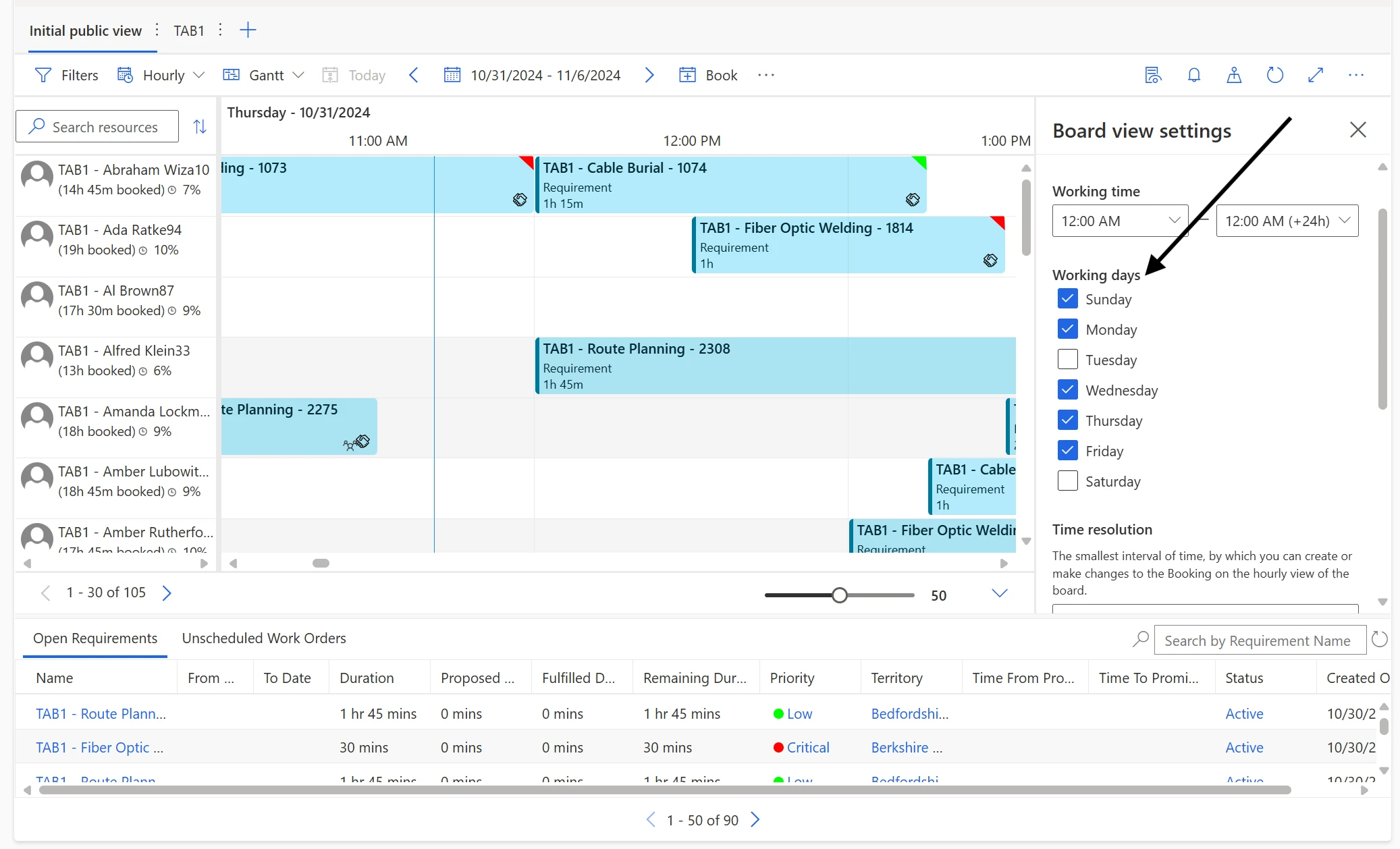
1) Days of the Week: With the new React board, you can now filter which days of the week you want to have displayed on your board’s hourly view. For example, if your technicians only work Monday to Friday, you can exclude the non-working days Saturday and Sunday for a more space-efficient board.

2) Reorder Tabs Control: Another top request from you was the ability to reorder tabs. For example, you can now prioritize your frequently used tab to load first when you open the schedule board. You can also multi-select more than one tab and move them all at once! This additional flexibility streamlines your day-to-day operations, making your workflow smoother and more intuitive.
3) Ellipsis control: In the past, your dispatchers may not have known that there was other capabilities off the resource panel such as View resource card or Get driving directions. Now with the new ellipsis (3 dot) control, they can access these options quickly and intuitively.

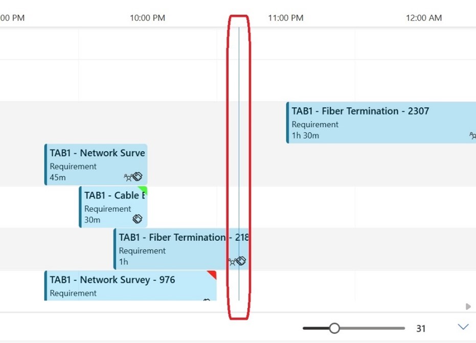
4) Dayline: On the previous schedule board, locating your current time and day position on a dense board was be a challenge. The new dayline makes it easier than ever to navigate the schedule board with precision and ease.

Experience the Next Chapter Today
The new Schedule Board on Universal Resource Scheduling is not just an upgrade; it’s a transformation. It’s faster, smarter, and more flexible, all while maintaining the familiarity you rely on. We can’t wait for you to experience the new level of efficiency and usability it brings to your scheduling tasks.
Join us in embracing this leap forward on 1 Nov 2024. Your scheduling, reimagined.
The post The next chapter for the Schedule Board: Enhanced Usability and Performance appeared first on Microsoft Dynamics 365 Blog.