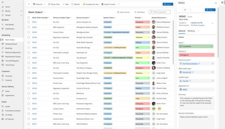
In the dynamic field of service management, efficiency, accuracy, and streamlined processes are key. The new work order experience in Dynamics 365 Field Service, introduced in the 2023 release wave 2 (release plan), offers a refreshed user interface that revolutionizes work order creation, management, and scheduling. We’ve continued to refine and add new features based on your feedback, and starting wave 1 2024, the new experience will be the default for all organizations (release plan).
What Is the New Work Order Experience?
The new work order experience is a complete revamp of the existing work order management system within Dynamics 365 Field Service. It simplifies the entire lifecycle of work orders, easing seamless collaboration among service managers, technicians, and dispatchers. Here are the key features:
- Experience the power of Copilot: Achieving operational excellence and building customer trust are paramount for organizations. Copilot, your companion in this journey, provides a summary of the current work order to help you get up to speed quickly. The contextually aware booking card suggests next steps, making the transition from incoming work to completed work smoother.
- Streamlined forms: The new work order form features visually appealing layouts with fields that can be quickly updated, reducing clicks by up to 39%. Say goodbye to cumbersome data entry and hello to efficiency.
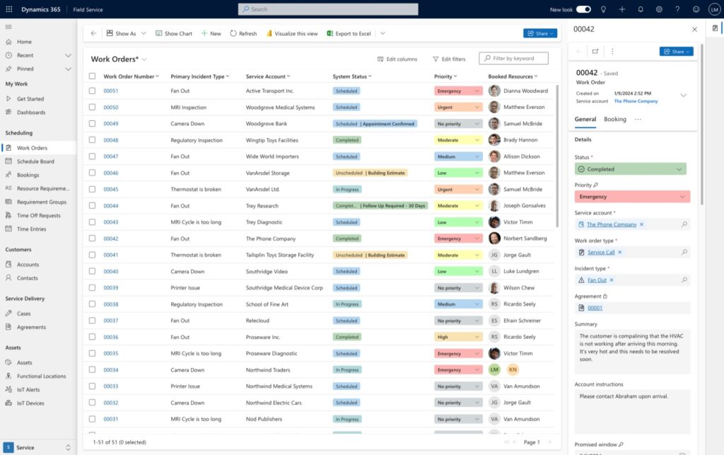
- Enhanced Work Order List: The revamped work order list lets you understand what’s most important to you by introducing visuals to denote work order status, priority, and booked resources. Common actions are readily accessible inline or through the all-new side pane, dropping the need to open a full form for minor updates.
Let’s explore each of these capabilities in more detail.
Overview of the new experience
Work Order Grid
We’ve rebuilt the work order grid from the ground up to increase performance and enable new capabilities such as inline editing of commonly changed fields like priority. We’ve enhanced the visual appeal of the status field and recently added the ability to see booked resources too. You can now configure whether you want just the work order ID or all linked entities to be clickable in the grid. Lastly, we’ve built inline actions and introduced a side pane for quick edits within the flow of work.
Work Order Form
We’ve updated the work order form to reflect how most organizations manage their work from start to finish. The most vital information is now in the General tab, we’ve merged billable work into a unified Products and Services section, we’ve grouped tasks and inspections under Tasks, and we’ve pulled all reference materials – such as knowledge articles, Dynamics 365 Guides, and timeline media – into the References tab.
General
We reorganized the general tab into a two-column setup for improved readability and better usability, focusing on the most essential information for service organizations. These enhancements are designed to make your daily tasks smoother and more efficient, based on user feedback and telemetry. Key improvements include:
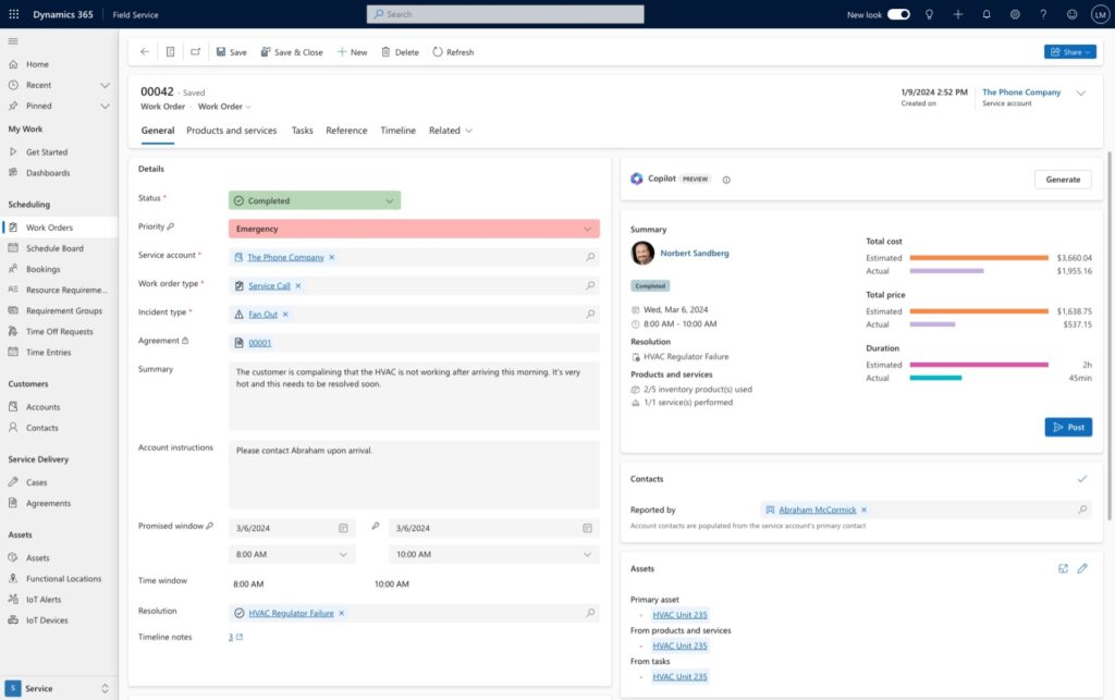
- Copilot summary: Copilot helps you quickly catch up on work details and suggests next steps based on the work order status.
- Contextually-aware booking card: This card is an evolution of the business process flow in Field Service, guiding you through the process of moving a work order from unscheduled to completed effortlessly.
- Asset card redesign: Set and view primary assets, along with any assets linked to products or services, with improved visualization and navigation of the asset hierarchy.
- Revamped location card: Easily pinpoint where work needs to be done on a map, with an enhanced visualization of functional locations using a hierarchical breadcrumb.
- Modernized contact card: Introduction of profile cards for detailed information on issue reporters and primary account contacts, facilitating easy communication via email, call, or Teams message.
- Improved priority field: Features color-coded priority indicators for better understanding of emerging priorities.
- Unified Status and Sub-status Field: Select both status and sub-status from a single field, with new color indicators for quick visual reference.
- Timeline notes counter: Quickly check if there are any linked notes in the timeline, reducing the need to access the full timeline experience within the general tab.
- Simplified action bar: Streamlined interface with commonly used actions, reducing clutter and focusing on essential functions.
Products and Services
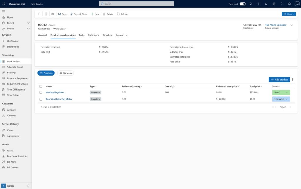
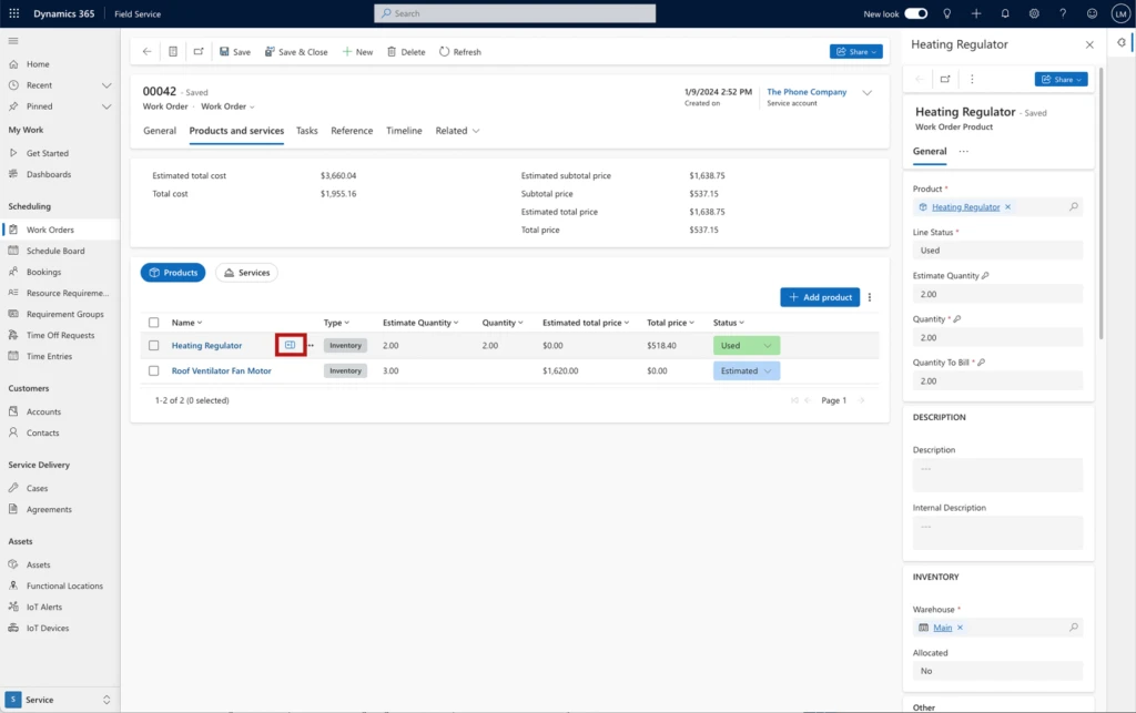
We’ve unified the Product and Services into a single tab, with a unified summary of financials atop it. Service managers can easily switch between the products and services view, make changes to used inventory and services inline, and open the side pane for more detailed changes.
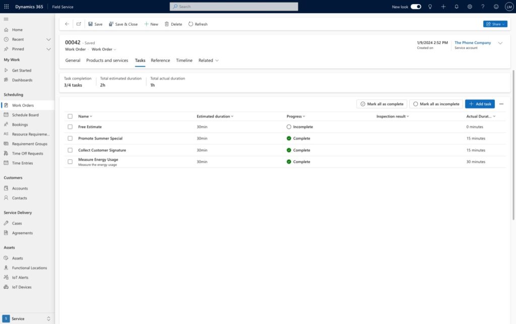
Tasks
The tasks section captures the steps that need to be done to complete the work. A summary card keeps count of scheduled vs. completed tasks and duration. You can also visualize if a tasks includes linked items to help technicians complete their work with Dynamics 365 Guides or capture their work result with inspections.
Reference
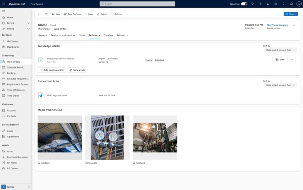
You can now find all your references in a unified experience that includes knowledge articles that capture fixes or known issues for commonly encountered issues, Dynamics 365 Guides that are linked to tasks, and media that has been attached to the timeline.
Side Panes
The introduction of the side panes is one of the biggest changes in the redesigned work order experience. Side panes allow you to see more details or make minor tweaks to related content in the context of your work. From being able to make tweaks to work order instructions from the work order grid, to updating product inventory financial data in a form, side panes keep you productive. Side panes are available in the work order grid, products and services grids, tasks grids, and when opening related items such as assets.


Transitioning to the new experience
Embracing change can be daunting, but the benefits are worth it. Starting wave 1 2024, the new experience will be the default for all organizations. There are several reasons why organizations should consider transitioning to the new experience starting now:
- Stay ahead: The field service industry is evolving rapidly. By adopting the new work order experience, you position your organization at the forefront of innovation.
- Future-proof your processes: Microsoft’s commitment to continuous improvement means that the new experience will evolve further. Be part of that journey.
- Training and support: Microsoft provides resources to help you transition smoothly. We’ve invested in robust documentation to guide you and your organization through the process.
Next Steps
The new work order experience in Dynamics 365 Field Service isn’t just an upgrade—it’s a leap forward. Embrace it, empower your team, and elevate your field service operations. Efficiency, collaboration, and customer satisfaction await!
Ready to take the plunge? Start your journey today to ensure your organization stays competitive and prepared for the future of field service management. Explore the official documentation to get started, download our adoption playbook to aid you in the deployment process, and don’t forget to share your feedback using the Feedback button in the app header. Together, we’re shaping the future of field service management.
The post Introducing the new Work Order Experience in Dynamics 365 Field Service appeared first on Microsoft Dynamics 365 Blog.
